Oct 27, 2026
Logo Colour Contrast on Dark and Heather Fabrics | Motion
One logo across twelve garment colours is one artwork and twelve contrast problems. What changes per background, what each method does, and the spec lines that keep every colourway readable.
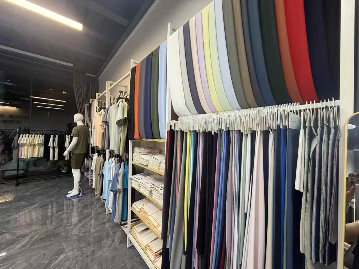
One logo across twelve garment colours is one artwork and twelve contrast problems. The file never changes; the background does, and contrast decides whether the mark reads at three metres or disappears. This article covers what changes per background colour, what each decoration method does about it, and the approval routine that keeps a multi-colourway order from becoming a guessing game.
The Contrast Problem by Background
Background colours fail a mark in different ways, so the fixes are different too:
• Background | What fails | The fix
• Dark (navy, black, forest) | Light inks sink into the fabric and look muddy | Light ink needs an underbase — an extra print pass
• Heather / marled | Texture breaks thin lines and small text | Thicker lines, larger text, higher-density marks
• Mid-tones (grey, royal, kelly) | Tone-on-tone looks deliberate but unreadable at distance | Push value apart — lighten or darken the ink, not both
• Brights (safety yellow, orange) | White looks dirty; light text vibrates | Cream or black ink often reads cleaner than pure white
• Multi-colour order, one artwork | All of the above at once | Approve per colourway, not once
The heather row is the one buyers underestimate most. Marled yarn puts light and dark fibres side by side, and a 1 mm line crossing that texture reads as broken at any distance. On heather, the artwork decision is structural: either the mark gets bolder for that colourway, or the colourway gets a different garment colour where the original mark works.

What Each Method Does With Contrast
Screen printing solves dark backgrounds with an underbase — a white pass printed first, colours on top. It is discrete spot colour by design, so contrast is controlled per ink: each Pantone sits exactly where you approved it (the tolerance logic in
Pantone matching and colour tolerance
).DTG and DTF handle gradients and full colour without colour-count limits, and on cotton they hold opacity well. On poly-blend performance fabric their films go down thinner, which is precisely where the dye-migration and opacity trade-offs live — dark performance wear with detailed light marks needs the ink system conversation before the run, not after.
Embroidery carries contrast differently: thread shade is chosen from a physical shade card against the garment fabric, and because stitch gaps show fabric through, a dark background under a dark thread needs fill adjustments rather than an underbase. On heather, embroidery is often the *strongest* choice — the stitch density sits on top of the marl texture instead of fighting it, and the mark's edge stays crisp.
The Underbase Decision
The underbase is the invisible pass that makes light-on-dark work, and it is the one line in the quote that moves both cost and feel:
- When it is needed: light inks on dark grounds. Without it, white on navy prints grey and looks worn out of the bag.
- When it is skipped: dark or tonal inks on light grounds, and deliberate tone-on-tone designs. Skipping it saves a print pass and keeps the hand softer.
- What it costs: one extra pass — a visible per-unit line on the quote, and slightly thicker hand where the underbase sits. The hand-feel trade is covered in print hand feel and ink deposit.
Write the decision, not the assumption: *"white underbase under all colours on navy and black colourways; no underbase on ash and white."* One line, no disputes.
Approving Colour Per Garment Colour
The multi-colourway order fails at approval more often than at printing, because one proof gets signed for twelve backgrounds. The routine that prevents it:
1. Strike-off per colourway — a physical print of the mark on each production fabric colour, not a render.
2. Judge at inspection distance — arm's length, in daylight, not a screen at 200% zoom.
3. Sign per colourway — each signed strike-off becomes the acceptance standard for its colourway, filed with the order.
4. Re-check the texture colours — heather and marl shift most between sample and bulk lots, so their strike-offs get the extra look.
The same physical-approval logic that governs colour tolerance governs contrast: the screen is where designs look finished; fabric is where they have to work.
One background nuance worth a sentence in the spec: "white" is not one colour. Optic white poly reads cooler and brighter than a natural heather cotton, so the same white ink can look slightly warm on one colourway and clinical on another. Nobody notices on a single-garment order; on a twelve-colourway programme the difference shows in the group photo. The fix is a note, not a redesign — state on the strike-off sheet which white the approval was judged against, and the print shop can compensate the underbase tone if the programme cares.
Spec Lines That Prevent Disputes
Four lines carry contrast protection on a multi-colourway PO:
• Spec line | What it fixes
• Pantone per ink, per background colourway | No "close enough" greys on tonal pairs
• Underbase: required per colourway, named | The cost-feel trade is decided on paper
• Minimum line width 1 mm print / 1.5 mm embroidery; text from 5 mm | Heather and marl breakage is designed out
• Acceptance: signed strike-off per colourway | Bulk is judged against its own background, not the navy one
Durability on dark grounds has one extra note: a heavy underbase stack on a performance fabric should go through the same
wash-test protocol
as any other print — contrast that cracks or fades is a short-lived contrast.Frequently Asked Questions
Will my white logo look the same on navy and on heather grey?
Brighter on navy — that is the underbase at work. On heather, the marl texture softens edges and slightly dims the mark, which is why heather colourways get their own signed strike-off rather than inheriting the navy approval.
What is an underbase, and does my order need one?
It is a white pass printed under the colours on dark garments, so light inks sit on a neutral layer instead of sinking into the fabric. Light-on-dark needs it; dark-on-light does not. It adds a print pass, so it appears as its own line on the quote.
Does embroidery work on dark fabrics?
Yes — thread is chosen from a shade card against the actual garment, and dark-on-dark marks are handled with fill adjustments rather than a backing layer. On heather, embroidery often holds edges better than print because the stitch sits above the marl texture.
Why does my logo look thin and broken on marled fabric?
The marl puts light and dark fibres side by side, and any line near 1 mm reads as broken across that texture. The fix is structural: thicken the mark for that colourway, enlarge the text, or move that colourway to embroidery.
Can one order mix methods so every colourway reads well?
Yes — that is the normal solution for a wide colour range: screen print on the solids, embroidery on the heathers, decided per colourway at quote stage. Each method prices separately, so the mix shows up clearly in the breakdown.
How do I approve colour for twelve garment colours without twelve rounds?
One strike-off session: the supplier prints the mark on every production fabric colour, you judge all of them at inspection distance in one sitting, and you sign each sheet. Twelve approvals, one courier, zero surprises at delivery.
Ordering one mark across many colours?
Send the artwork and the colourway list — we will return the underbase plan, the method per colourway and a per-colour strike-off schedule with the quote.